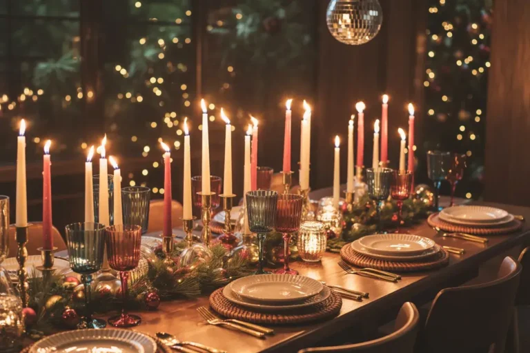
Forget Red & Green: 23 Christmas Color Schemes That Feel Fresh and Modern
Are you feeling a little tired of the same red and green every single year? I know I’ve been there, looking for fresh Christmas color schemes to make the season feel new again. It’s fun to step outside the box and try something different. This year, let’s explore some beautiful and unexpected holiday palettes.
Your home’s holiday style should feel like an extension of you. Think of it as dressing your home for its favorite party of the year.
You don’t have to follow traditional rules. Sometimes the most memorable looks come from breaking them. Let’s find a color combination that makes your heart sing.
Christmas color schemes
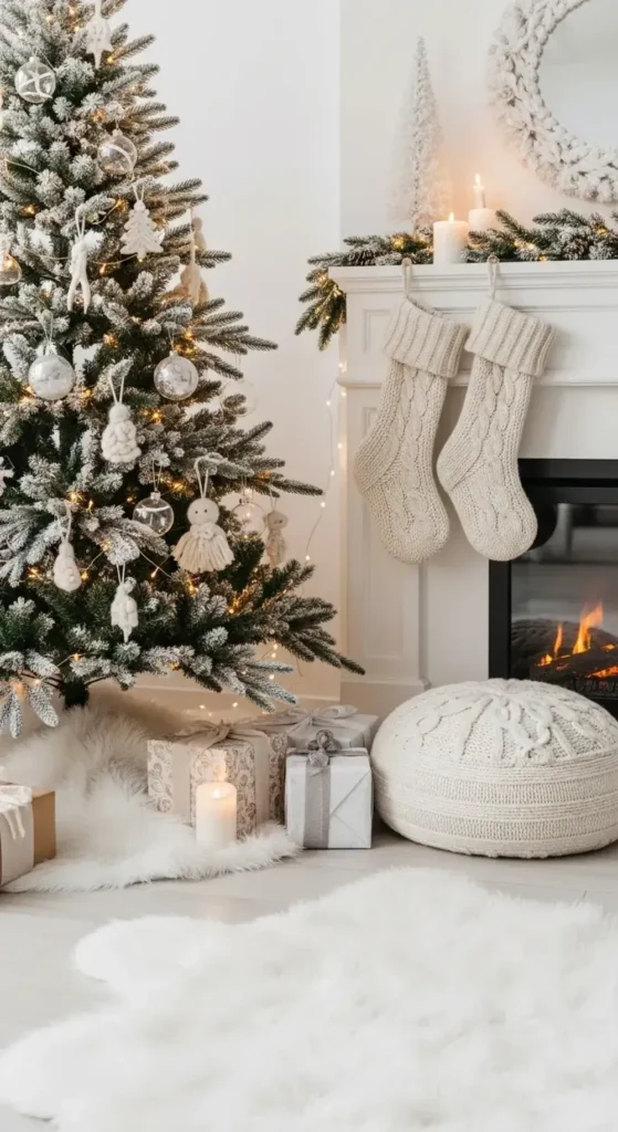
1. Frosty Blue and Silver
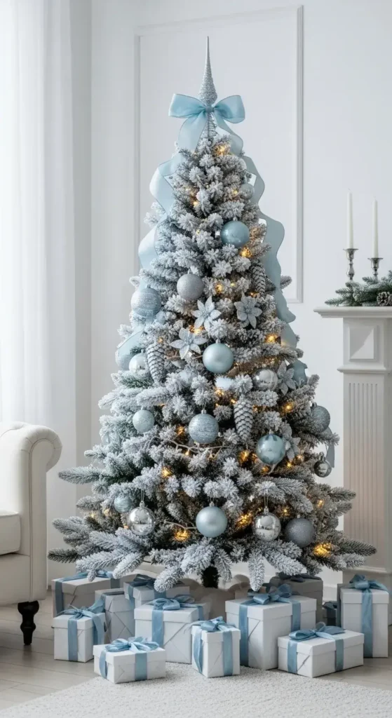
Imagine your room looking like a quiet, snowy morning. This combination is so serene. Light blue ornaments mix with shiny silver ones on the tree.
A soft blue throw blanket is draped over your couch. White fairy lights add a smooth, magical glow. This look is calm, cool, and simply beautiful.
Here’s how I’d approach this elegant style.
I would start with a flocked tree to enhance the snowy feeling. Then, I would layer on ball ornaments in different textures, like matte blue and shiny silver.
Add little touches like silver-painted pinecones and a light blue ribbon tree topper.
2. Soft Pink and Gold Glow
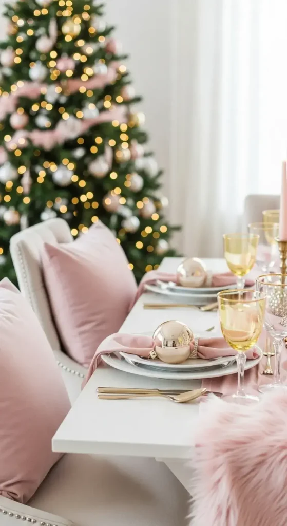
This style is romantic and incredibly warm. Picture delicate blush pink ribbons tied on gifts under the tree. Shiny gold ornaments catch the light and sparkle beautifully.
A simple pink runner on your dining table paired with gold-rimmed glasses feels so elegant. It’s a sweet and pretty way to celebrate.
My tips for achieving this soft and pretty look.
Use lots of warm-toned metallics. I suggest mixing champagne gold with traditional yellow gold for more depth. Add soft textures like blush velvet pillows or a pink faux fur tree skirt. This makes the space feel extra cozy.
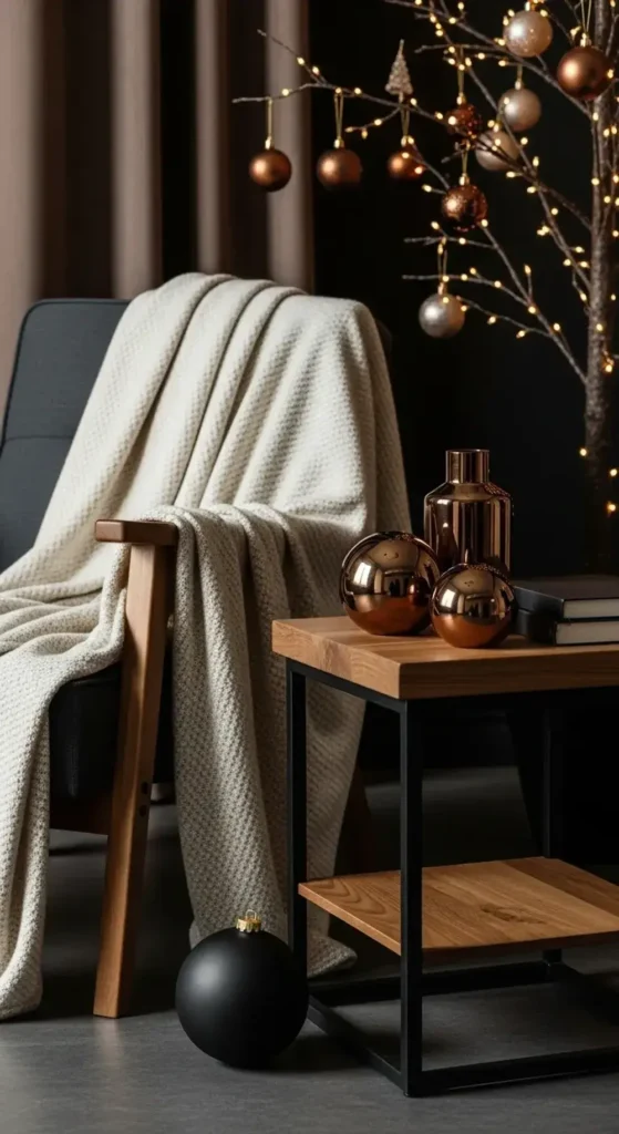
3. Moody Navy and Copper
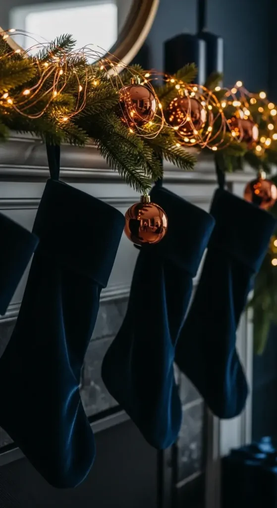
For a look that feels rich and cozy, try deep navy blue and copper. Imagine velvet navy stockings hanging from a mantel decorated with copper fairy lights.
The dark blue makes the warm metal pop. This combo feels sophisticated and stylish, perfect for a quiet winter night. It’s one of my favorite unexpected Christmas color schemes.
Here’s how to make this dramatic palette work.
Don’t be afraid to go dark with your main elements. Navy blue wrapping paper makes a big statement under the tree. Then, weave in lots of copper, from wire garlands to metal ornaments. The contrast is what makes this look so striking.
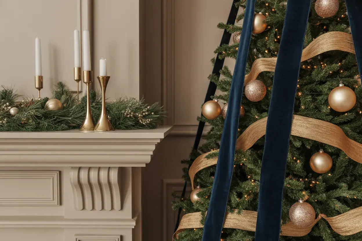
4. Emerald Green and Brass
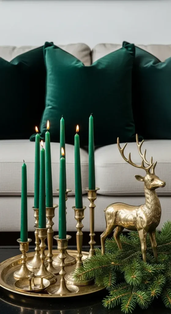
This isn’t your traditional Christmas green at all. It’s a deep, rich, jewel-toned emerald. Pair it with the warm, vintage glow of brass.
Think emerald green candles in brass holders. Picture green velvet pillows on the sofa. It feels luxurious and absolutely timeless right away.
My advice for styling this luxe combination.
Incorporate natural elements to keep it from feeling too formal.
I would add simple pine garlands on the mantel or staircase. The natural green of the pine will complement the deeper emerald hue beautifully. Brass reindeer figures would look perfect.
5. All-White Winter Wonderland
You can create a peaceful, snowy escape right inside your home. The key is to use different shades and textures of white.
A fluffy white tree skirt and cream-colored wool stockings feel so soft. Clear glass ornaments make everything feel clean and bright. It’s a minimal and serene holiday style.
Here’s how to keep an all-white theme interesting.
Focus on texture above everything else. Mix chunky knits, faux fur, smooth ceramic, and sparkly glass. This variation is what brings the look to life. Adding warm white twinkle lights prevents it from feeling cold.
6. Black, White, and Gold
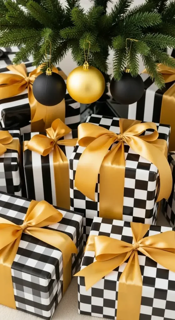
This combination is bold and delightfully glamorous. Use a base of black and white, maybe with a striped ribbon or checkered wrapping paper.
Then, add brilliant touches of gold. Gold ornaments, cutlery, and candle holders make a big statement. It has a classic, party-ready feel that everyone will love.
To really nail this graphic and chic style.
I would choose a theme and stick with it. Maybe it’s bold stripes or a playful polka dot. Use that pattern in your ribbons and gift wrap. Then, go all out with the gold. More is more with this palette!
7. Terracotta and Cream
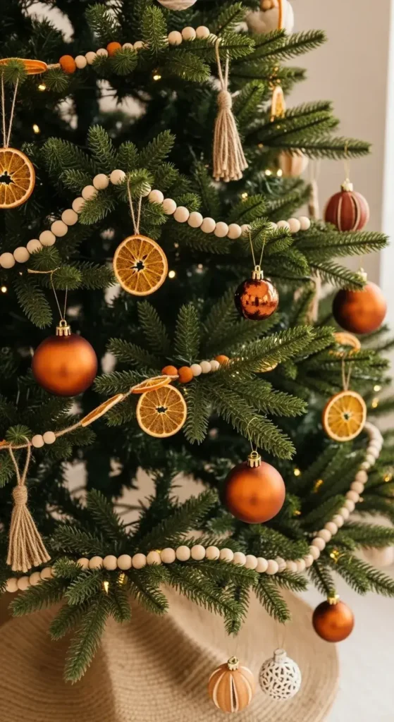
Bring some warm, earthy tones into your holiday decor. Think terracotta-colored ornaments and dried orange slices on the tree.
Cream-colored knit stockings and cozy blankets keep it soft. This palette feels natural, very calm, and connected to nature. It gives off a lovely bohemian vibe.
My tips for using this earthy palette at home.
I would add other natural textures to complete the look. Think about using a jute tree skirt or a wooden bead garland. You could also make your own DIY salt dough ornaments in terracotta tones.
8. Dusty Rose and Sage Green
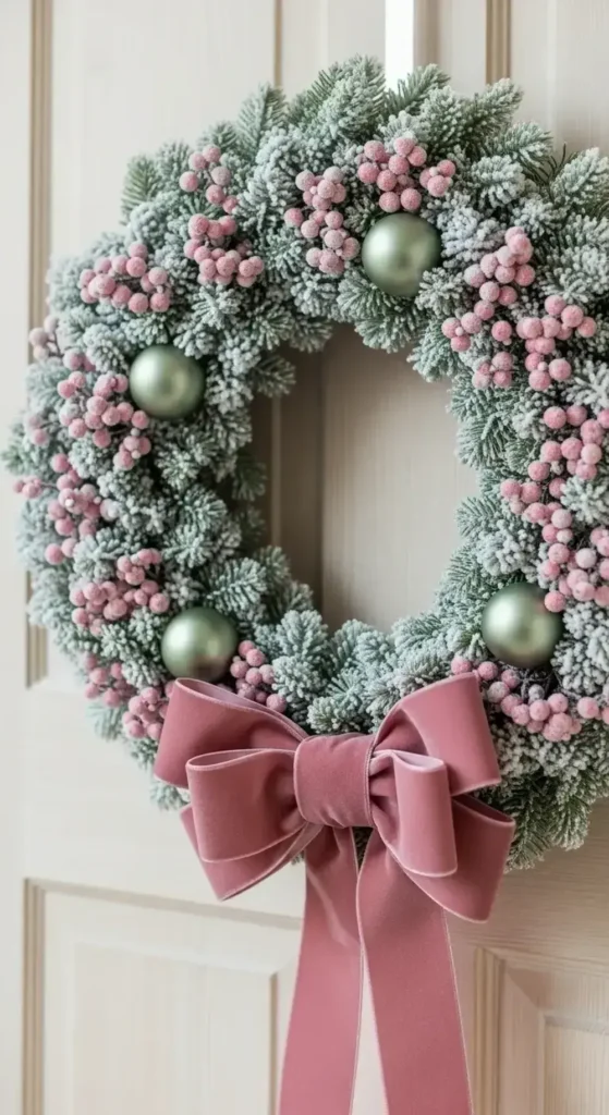
For a soft and gentle holiday look, mix dusty rose with a muted sage green. These colors are peaceful and pretty together.
Imagine sage green wreaths decorated with small, dusty pink berries. This palette is subtle and feels like a calm winter garden scene. It’s a fresh take on Christmas color schemes.
How to get this soft and romantic look just right.
Lean into frosted and matte finishes for your ornaments. A frosted sage green wreath is a perfect starting point. Then, find dusty rose velvet ribbon to hang ornaments or wrap gifts. The different sheens create a beautiful effect.
9. Deep Plum and Champagne
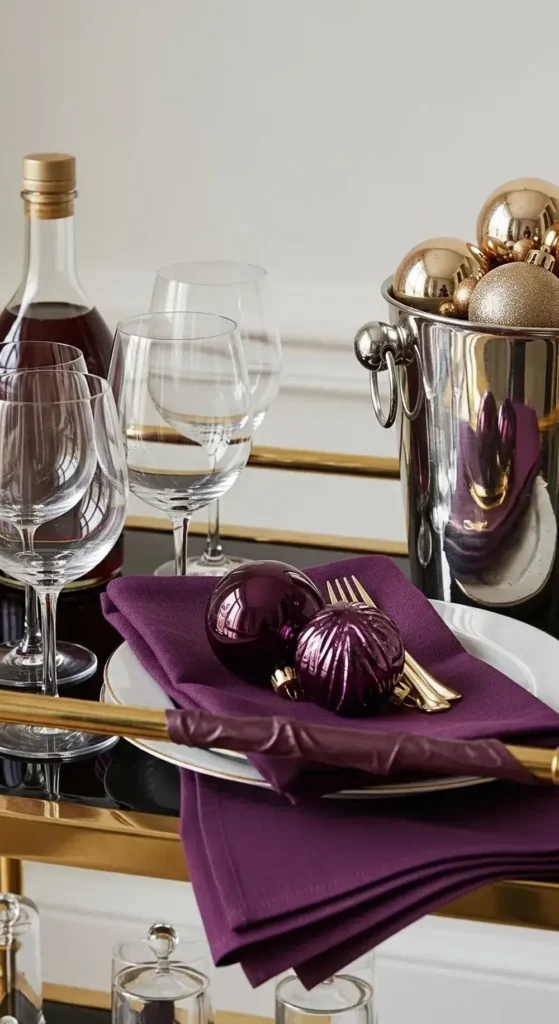
This is a truly royal and elegant color scheme. Deep, rich plum tones on ribbons or ornaments feel wonderfully luxurious.
You can pair them with the light, bubbly color of champagne gold. This look is totally unexpected and very sophisticated for holiday gatherings.
My suggestions for this sophisticated combination.
Use plum as your rich accent color. A few deep plum glass ornaments will stand out beautifully on a tree. Then, fill in the rest with shimmering champagne gold and soft cream tones for a balanced look.
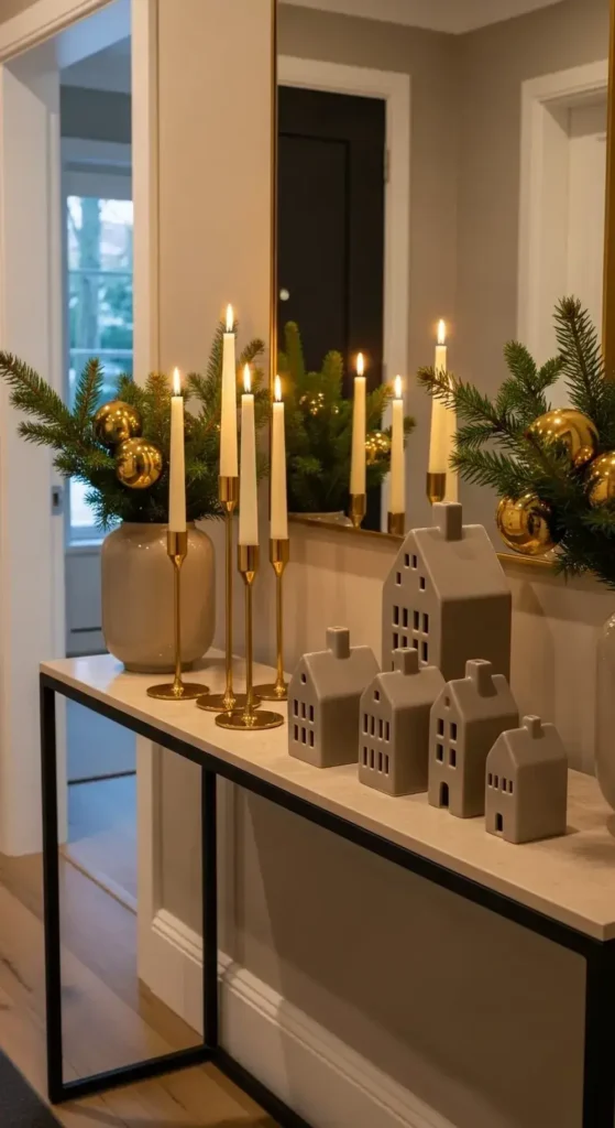
10. Charcoal Gray and Winter White
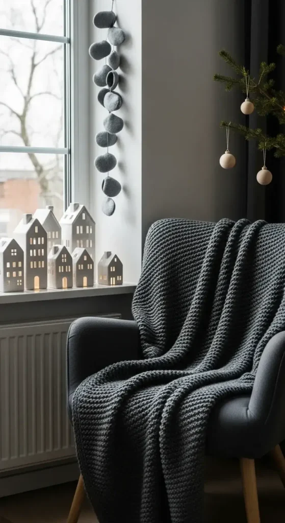
Inspired by cozy Scandinavian winters, this look is simple and beautiful.
I love using different shades of gray for blankets and pillows. Add pops of clean winter white with ceramic houses or simple ornaments. It’s comforting, minimal, and very chic.
Here’s how to make this minimalist style feel cozy.
Add lots of soft textures and natural wood tones. A gray felt garland, white knit stockings, and a few light wood ornaments will warm up the space. It’s all about creating that feeling of “hygge.”
11. Teal and Burnt Orange
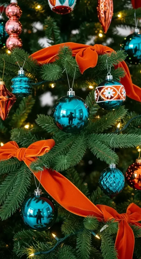
This combination has a very cool, retro vibe that I adore. Deep teal ornaments look stunning against the warm glow of burnt orange velvet ribbons.
It’s a unique and lively choice that feels both festive and stylishly different. Talk about memorable Christmas color schemes!
My favorite way to style this vintage-inspired look.
Have fun with it. This palette is playful and bold. I would look for ornaments with retro shapes and patterns. Mix and match teal and burnt orange on your tree for a vibrant, energetic display that feels really joyful.
12. Lavender and Pewter
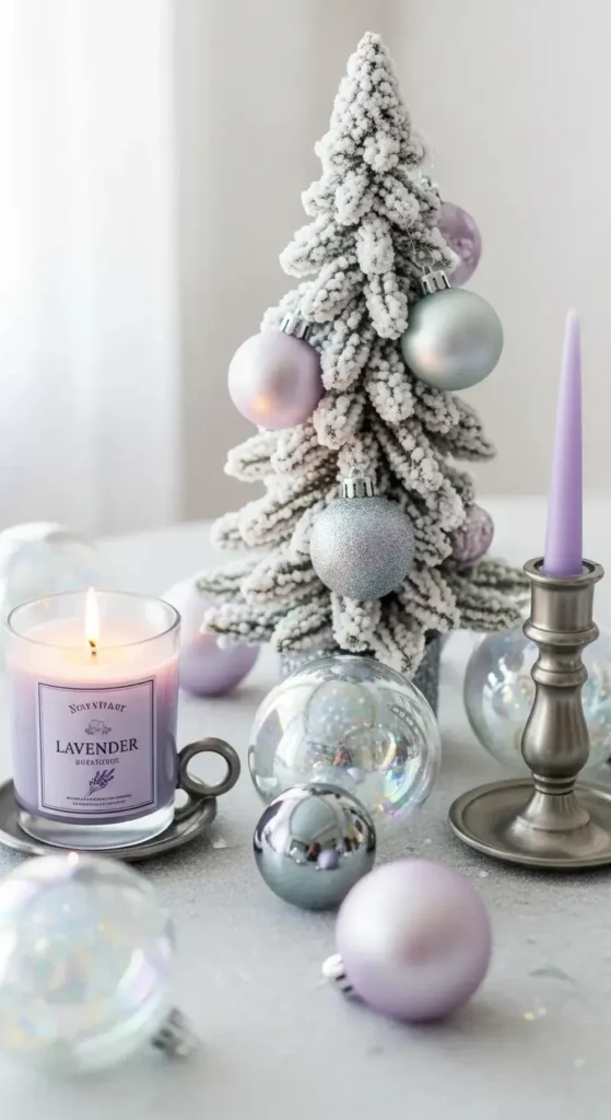
Create a dreamy, frosty look with soft lavender and cool-toned pewter. Lavender-scented candles and light purple ornaments create a sense of calm.
The matte finish of pewter adds a modern, almost industrial touch. It’s a truly unique and gentle holiday palette.
Here’s how I would bring this dreamy look to life.
Use silver or a flocked tree as your base to enhance the cool tones. Incorporate iridescent and clear glass ornaments to catch the light. This will make the lavender and pewter feel even more magical and ethereal.
13. Mustard Yellow and Gray
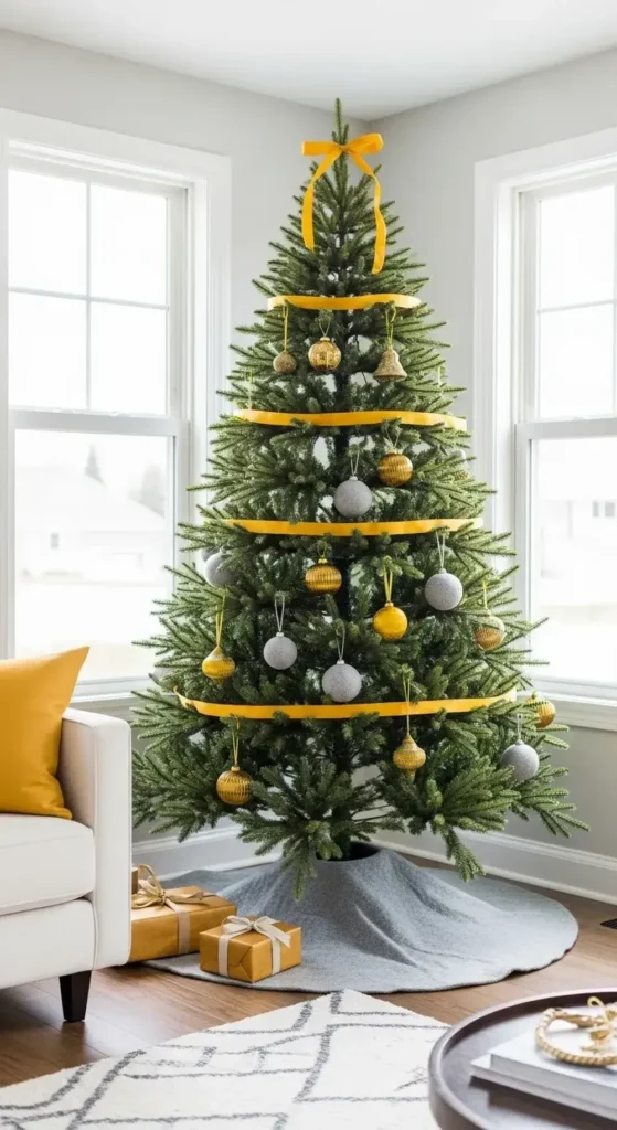
For a cheerful and modern Christmas, try a pop of mustard yellow. Yellow ornaments and ribbons add a splash of sunshine on a cold day.
I recommend pairing it with soft gray elements to keep it grounded and sophisticated. This scheme is happy and so bright.
My tips for balancing this bright and modern palette.
Use gray as your neutral base color. Think about gray felt ornaments or a gray wool tree skirt. Then, use mustard yellow as your accent. A few yellow ornaments and a ribbon will provide that perfect pop of color.
14. Peach and Mint

This palette is fresh, light, and wonderfully playful. Soft peach-colored baubles can hang next to cool mint green ones on the tree.
It feels like a breath of fresh air during the winter season. This look is perfect for anyone wanting a holiday that feels cheerful and bright.
How to make this sweet combination feel festive.
I suggest adding a touch of soft gold or silver to elevate the look. A little bit of metallic sparkle will make the peach and mint feel more like Christmas and less like spring. It adds just the right amount of holiday magic.
15. Forest Green, Black, and Wood
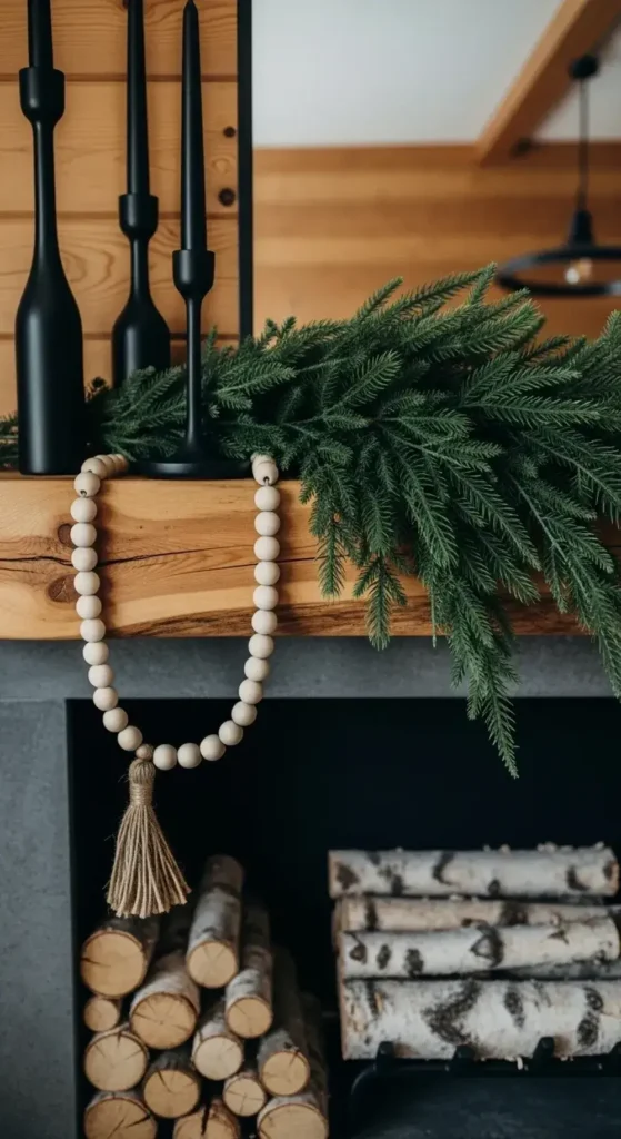
You can get a cozy, modern cabin feel with this trio. Use an intense forest green as your main color. Then, add matte black ornaments and accents for contrast.
Natural wood elements, like bead garlands or coasters, bring warmth. It’s a moody and organic style that I find very comforting.
My advice for mastering this rustic-modern vibe.
It’s all about texture. Pair the deep green with matte black metal accents. Then, layer in lots of natural wood, from birch logs by the fireplace to a simple wooden star on top of the tree.
16. Cranberry Red, Sans Green
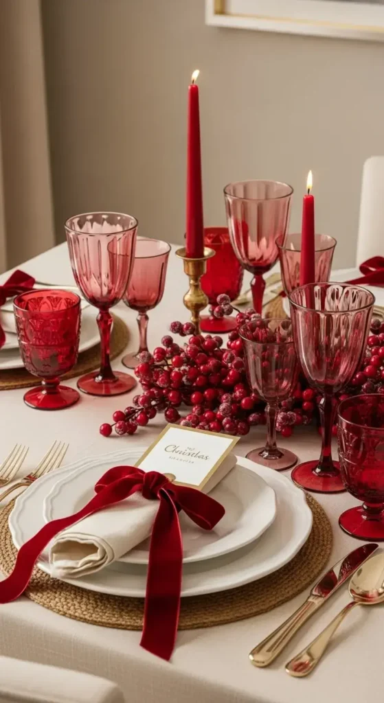
Keep the classic warmth of red but give it a modern twist.
The key is to focus only on rich cranberry red. Pair it with neutral colors like cream, beige, or gold. Cranberry-colored glassware and luxurious velvet ribbons look stunning on their own without green. It feels classic but fresh.
To make this monochromatic red look truly special.
Vary the shades and textures of red. Mix deep cranberry with slightly brighter tones. Use different materials like glass, velvet, and berries to create visual interest. This keeps the look from feeling flat.
17. Shades of Ocean Blue
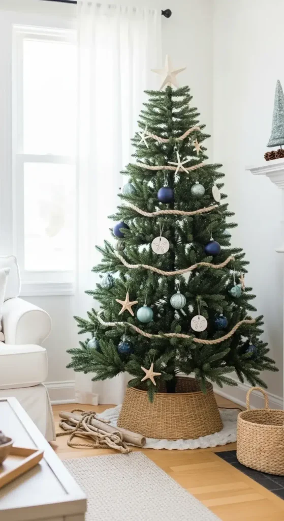
Bring a peaceful coastal feel to your Christmas decor. Layer different shades of blue, from deep navy to light seafoam green.
Mix in natural textures like rope, rattan, or even driftwood. This look is incredibly calm and reminds me of a peaceful winter beach.
My tips for creating a coastal Christmas look.
Instead of traditional ornaments, think about using starfish or sand dollar shapes. You can wrap a simple rope garland around the tree.
This helps tell that coastal story in a subtle, beautiful way. This is one of the most calming Christmas color schemes.
18. Coffee, Cream, and Gold
Make your home feel as cozy and inviting as a warm latte. Use shades of brown, from deep espresso to light coffee-and-cream beige.
Then, add a little sparkle with soft gold accents. This palette is inviting, warm, and very relaxing.
How to achieve this warm and inviting atmosphere.
I suggest focusing on cozy fabrics. Think brown velvet ribbons, cream-colored knit blankets, and beige pillows. Then, sprinkle in just enough gold with ornaments and candle holders to make it shimmer and feel festive.
19. Magenta and Silver
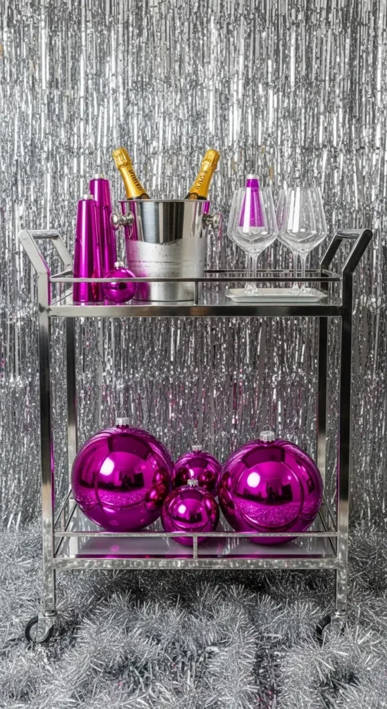
Go bold with a vibrant pop of magenta this year! This bright, pinkish-purple color is full of energy and fun.
Pair it with sleek, modern silver to make it feel futuristic and festive. It’s a great choice for a fun holiday party atmosphere.
My suggestion for using this bold, fun color.
A little magenta goes a long way. Use it for your statement pieces, like a few oversized ornaments or your tree topper. Then, use silver and white for the rest of your decor to keep the look clean and modern.
20. Iridescent and White
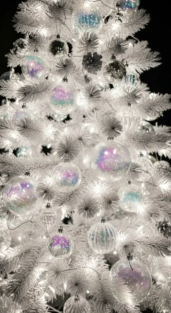
You can create a magical, shimmering look with this simple combo. Use lots of ornaments and decor that have an iridescent finish.
They reflect a beautiful rainbow of soft colors. Keep everything else simple and white to let that shimmer be the star. It feels like a fantasy winter world.
Here’s how to create this ethereal, glowing look.
The lighting is key. Use plenty of soft white twinkle lights on your tree and around the room. The lights will bounce off the iridescent surfaces. This creates a mesmerizing, ever-changing color-and-light show.
21. Greige and Warm Gold
“Greige” is that perfect mix of gray and beige. It’s the ultimate sophisticated neutral color. It creates a warm and inviting backdrop for your holiday decorations.
Add touches of warm gold through candle holders and ornaments. The result is a look that is understated and so elegant.
My advice for this sophisticated neutral palette.
Play with different finishes. Pair matte greige ornaments with shiny gold ones. Add textures like linen and aged metal. This creates a rich, layered look that feels very collected and high-end, yet still cozy.
22. Deep Teal and Silver
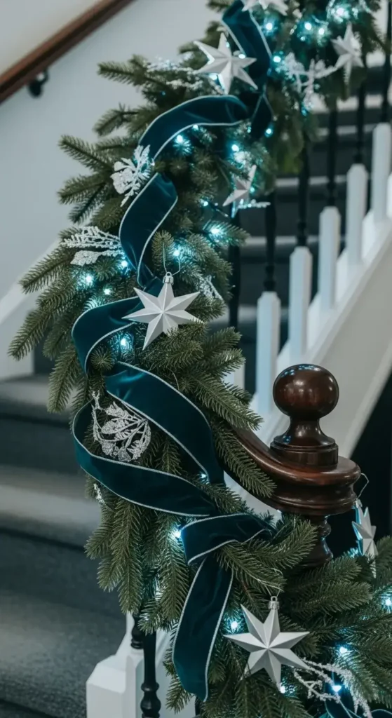
This is a seriously cool and elegant combination. The deep, rich color of teal feels incredibly luxurious on its own.
When you pair it with bright, crisp silver, the whole look becomes modern and very polished. Imagine teal velvet stockings with silver monograms hanging from the mantel.
Here’s how I would style this cool and polished look.
Keep your lines clean and your decor minimal. This palette is strong enough to stand on its own. Choose ornaments with simple shapes, like spheres and stars. A silver tinsel garland can add a touch of retro sparkle.
23. Bronze, Cream, and Black
For a strong and stylish look, mix the warm metal of bronze with soft cream and sharp black. Bronze ornaments add a deep, warm glow. Cream-colored textiles like stockings and tree skirts keep it feeling soft.
Black accents provide a touch of modern drama. It feels both industrial and cozy.
My tips for balancing this strong, dramatic palette.
Use cream as your main buffer color. It will soften the contrast between the dark bronze and the stark black. A few matte black ornaments will add that perfect modern edge without overpowering the look.
Whew, that’s a lot of inspiration!
I hope these unique Christmas color schemes get you excited to decorate. Don’t feel pressured to pick just one.
You can even mix and match elements from different palettes to create a look that’s all your own. The most important thing is to have fun and create a space that feels festive and joyful to you.
What new color combination are you thinking of trying this year? I’d love to hear your ideas in the comments below.